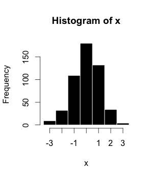
File:Example_histogram.png · Wikimedia Commons · See Wikimedia Commons
AI overview
A histogram is a type of chart that shows how often different values appear in a set of data by dividing the data into groups (called bins) and displaying the frequency of each group as a bar. Histograms are useful because they let you quickly see patterns in data, like whether values tend to cluster in certain ranges or how the data is distributed overall.
AI-generated from the Wikipedia summary — may contain errors.
Wikidata facts
- Subclass of
- bar chart
- Part of
- statistics
- Depicts
- probability distribution
- Image
- Histogramme taille.svg
Show 6 more facts
- maintained by WikiProject
- WikiProject Mathematics
- uses
- data binning
- Commons category
- Histograms
- Stack Exchange tag
- stackoverflow.com/tags/histogram
- Commons gallery
- Histogram
- facet of
- statistics
via Wikidata · CC0
Article · 中文
在统计学中,直方图(英語:histogram)是一种对数据分布情况的图形表示,是一种二维統計圖表,它的两个坐标分别是和该样本对应的某个属性的度量,以長條圖(bar)的形式具體表現。因為直方圖的長度及寬度很適合用來表現數量上的變化,所以較容易解讀差異小的數值。 直方图是品质管理七大工具之一。
Abstract from DBpedia / Wikipedia · CC BY-SA